


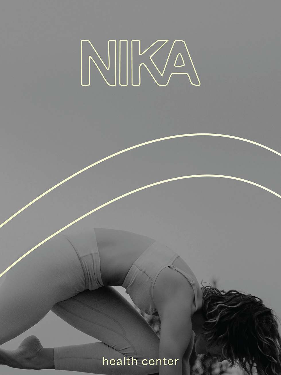
NIKA
We invite you to explore the vibrant visual identity of NIKA, a wellness space dedicated to movement, renewal, and inner balance. For NIKA, we created a dynamic branding system where bright, lively colors come to life, reflecting the energy and vitality of the space.

Colors in motion
The NIKA color palette evokes a sense of calm, vitality, and balance, like sunlight warming a quiet morning stretch. Soft Glade, Cool Verdure, and Gentle Pebble form a grounding base, while Solis adds a subtle spark of energy. The colors flow together like the body in motion, supporting both stillness and movement. They can be used in varying opacities, allowing one hue to take the lead depending on the application.
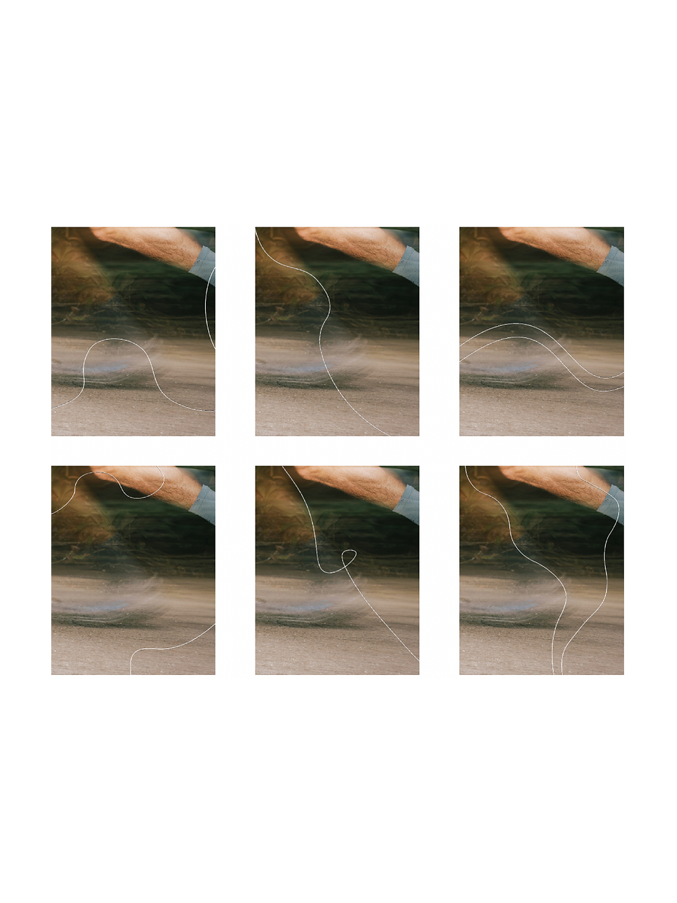
Bringing movement to life
Our illustrations bring life and personality to the NIKA world, combining energy and visual storytelling. Each stroke and shape celebrates movement, capturing the fluidity of the body and the ease of mindful presence. Playful and delicate, the illustrations spark curiosity and invite connection, adding depth and rhythm to the space. They work in harmony with our colors and lines, guiding the eye, inspiring exploration, and creating moments of calm joy.


Window design
The window design perfectly reflects NIKA’s visual identity. Bold and eye-catching, it draws attention effortlessly. The interplay of lines and text creates a cohesive, inviting look that captures the essence of the brand.


Reflection
Working on this project was an instructive experience that allowed us to explore color in bold and expressive ways. Our discussions and experiments with lines, shapes, and illustrations pushed the project in a creative directions. By expanding our knowledge, we were able to create a cohesive, dynamic brand that reflects both our collective vision and NIKA’s philosophy.